
{Case Study} Visual Brand Identity Building with Kate Holden
Aug 11, 2022Meet Kate Holden
If Kate is known for one thing, it’s taking everything to the next level.
In a room full of impressive entrepreneurs, Kate stands out. Equipped with the proven ability to run several businesses, a multitude of leadership roles within EO, and a non-profit board that grants wishes of terminally ill children, you’d think she’d have no further to climb. But she wouldn’t be Kate if she was satisfied with what she’s accomplished thus far.
As we learned very quickly, there was always a way to take things to the next level and our personal branding agency was the natural next step in her journey to help her do just that.
Personal Branding - Searching for Portability
When Kate came to Brand of a Leader, she needed help establishing her personal brand. As a Canadian serial entrepreneur, she owned one of the fastest-growing private wine and spirit brands in the country. The problem was that the wine business still carried the original owner’s name and in the process of rebranding it, she wanted to be known as more than just its CEO. As many successful entrepreneurs will come to realize, she was looking for portability beyond her businesses; a way to be seen as something much bigger as an entrepreneur and leader.
We got to work right away and after weeks of uncovering the essence of who she was, we came to this conclusion: Kate was a portfolio entrepreneur taking abundance mindset to one level extra. With a concrete personal brand developed, we were ready to scale.
The branding was an instant success, and right away her community started embracing her personal motto #OneLevelExtra. When her friends, family and even people she knew to tag her online, they typically use the hashtag alongside it!
Visual Identity - Building Associations
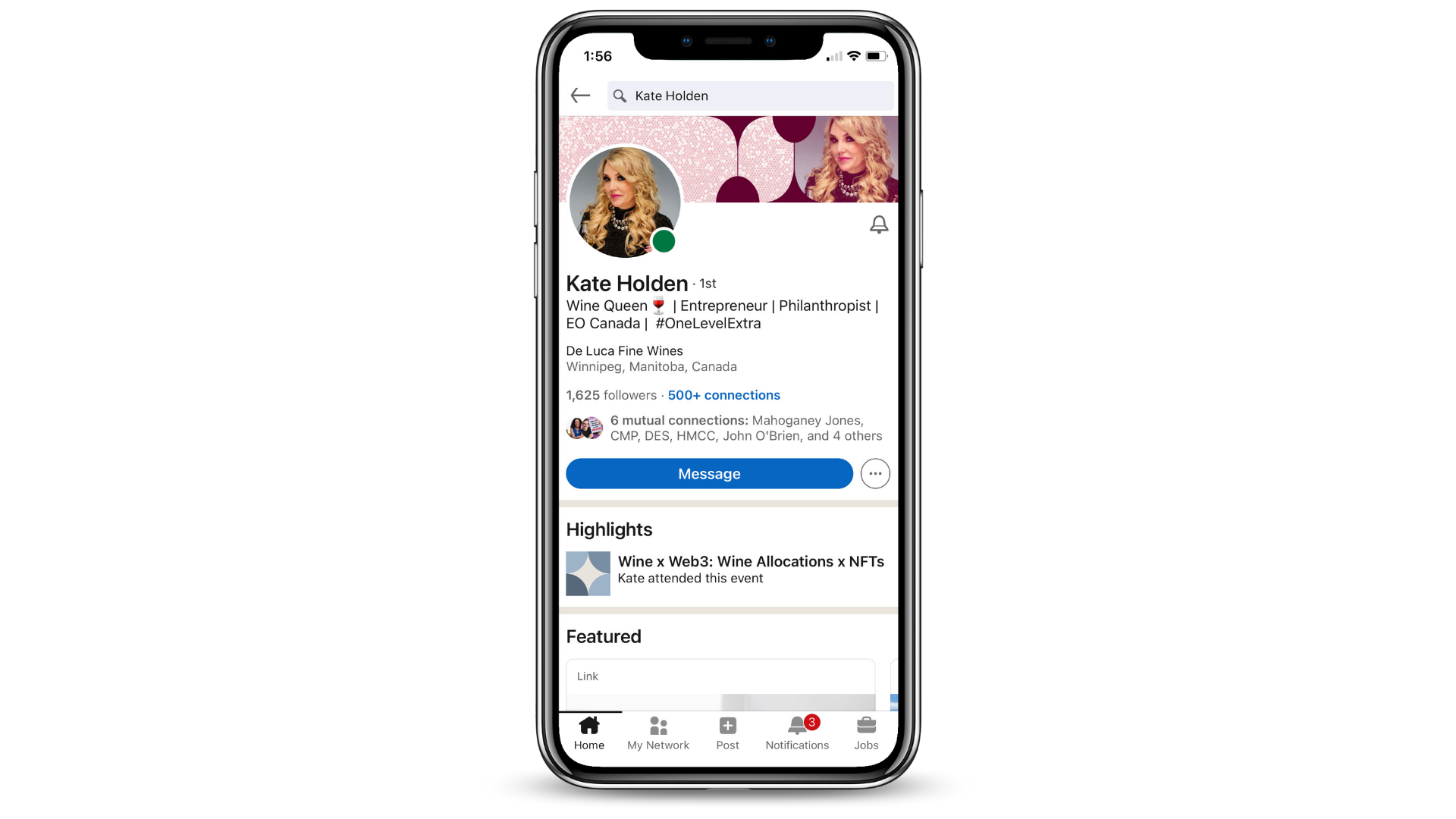
With her new brand in tow, Kate started receiving inquiries from organizations asking her to speak. She realized that although her personal brand spoke to who she was, her visual identity did not. If she was going to access new audiences, she wanted to build brand recognition among them that would go further than making an impression in person.
If you’re an entrepreneur like Kate and you’re ready to scale your visibility as a leader, a visual identity can be your accelerant. Done well, it can tie all aspects of your brand together and build brand recognition right from the get-go. It can also go a long way by offering consistency that reaches your target audience, builds trust among them and creates an overall better experience for them.
We made it so that the moment they crossed paths with Kate, people knew who she was, what she was about and what she stood for.
Here’s how we did it:
A Brand Identity Guide - Consistency is Key
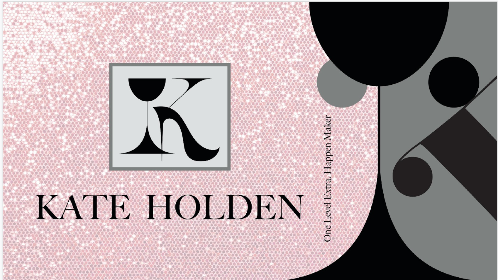
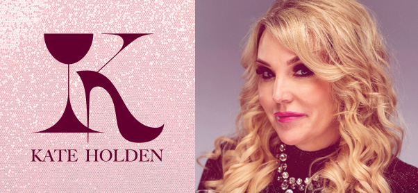
Perhaps the most important part of a visual identity is the logo. It ties the colour palette, fonts and personal brand altogether in a simple but unique package. It’s how we took Kate’s positioning from words to visual terms. Since it takes a tenth of a second to form a first impression of someone, a logo speaks volumes.
The focal point of Kate’s logo rests on two symbols: a wine glass and a stiletto heel. Although we usually steer clear of integrating businesses into branding, Kate is the exception. Fashion and wine are not only what she does but who she is too.
In the background, an array of shiny glitter falls onto a baby pink backdrop. This is done purposefully to show off Kate’s bold, feminine and “extra” side. The glitter element is made to replicate the brilliant feeling people get when they’re around her.

The logo is one of three elements provided in the brand identity guide, along with a colour palette and typography. Altogether, they give Kate a new way to express herself and build associations with unfamiliar audiences. From slide decks and email signatures to business cards and social media posts, leveraging this guide creates consistency. This is important because with consistency comes recognition and with recognition comes associations. Think of the iconic Nike swish. Any hooked checkmark for that matter is now inherently connected to the athletic brand. That’s what we did for Kate.
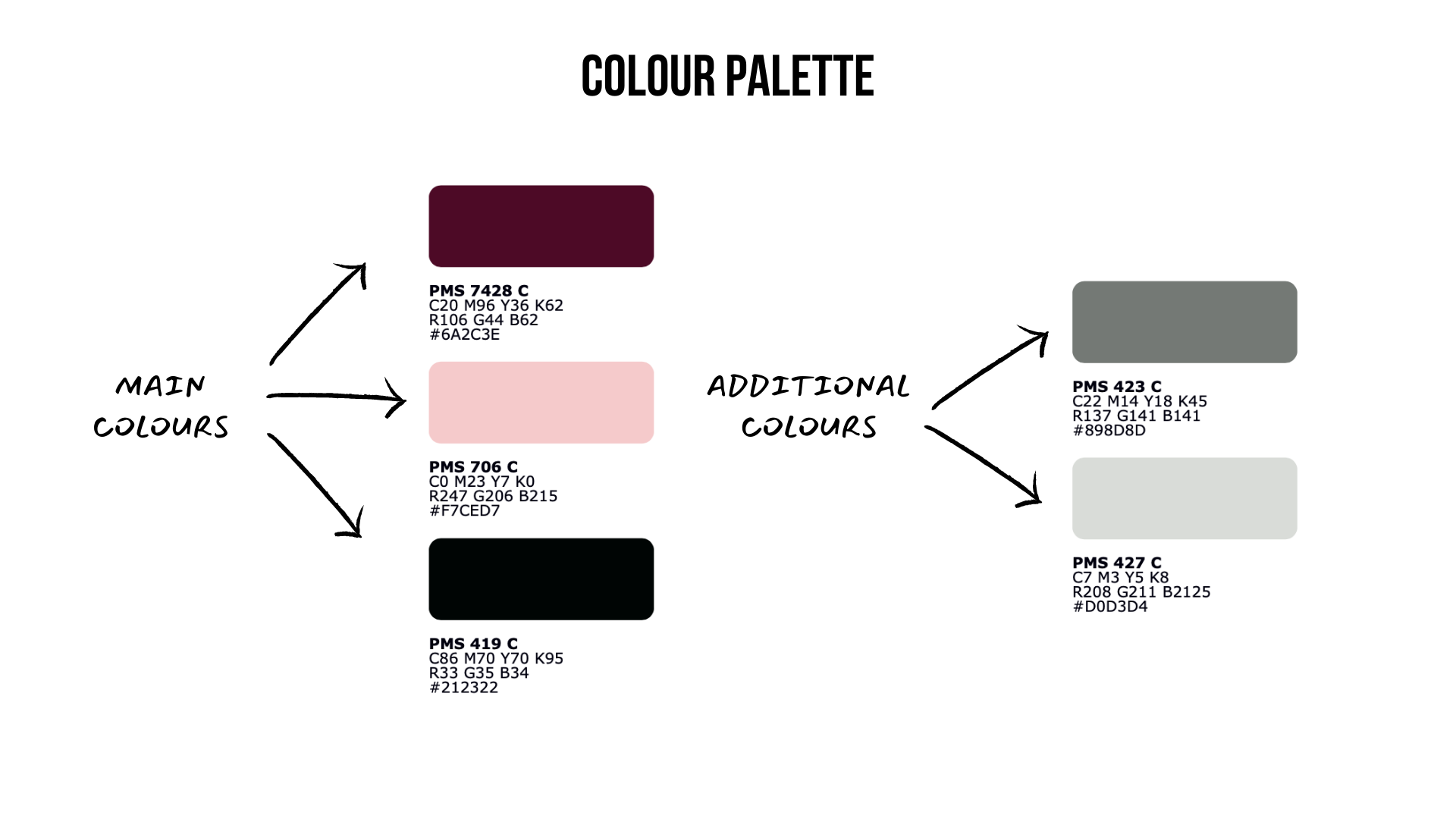
Colour plays an important role in visual branding. In fact, using a signature colour can actually increase brand recognition by 80% (Reboot, 2018). In this case, there’s no mistaking that the crimson red lipstick colour is Kate’s signature. When we create a colour palette, we stick to a proven formula: three main colours and two additional colours. Five is the magic number because using any more becomes indistinguishable and any less would leave Kate vulnerable to inelasticity.
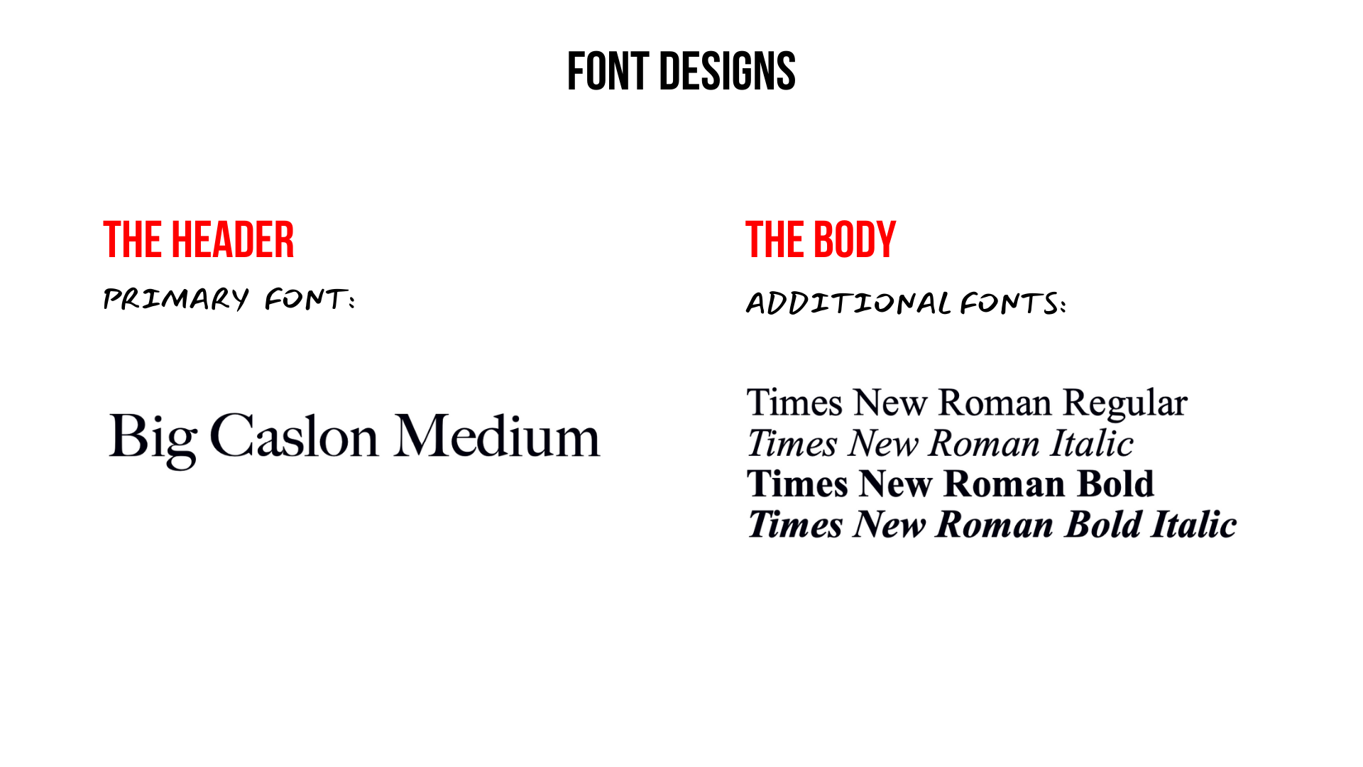
Often the most overlooked part of visual identities is the typography. Font designs are tricky because they must look good while also remaining readable and professional. We went with serif fonts for Kate because they align best with her timelessness and class. The primary font is used exclusively for headers while the additional fonts are used exclusively for the body. It’s important that these fonts stick to their lanes because any inconsistency can really throw the brand’s credibility off.
Visual Branding Assets - Tying It All Together
With the visual branding guide finalized, we started applying it to Kate’s visual assets. Here are a few examples:
A Branded Slide Deck
Email Signature

Social Media Card
With these elements incorporated into public-facing designs, the visual branding offers Kate clarity on her unique positioning and elevates it even further. With these new sharp elements integrated consistently, Kate’s credibility as an expert and professional is cemented. Rather than having to cultivate her brand in front of a new audience, Kate can now easily deliver it in the form of these visual elements.
"This process has given me further clarification of not only who I am, but how I want to present myself to others,” Kate says.
A brand is all about a unique positioning and associations. Once the personal brand is set, scaling brand recognition really takes off, especially if the visual identity is done cohesively. That being said, no amount of cool fonts, bold colours or crazy consistency will support your brand if it isn’t authentic to who you are.
We don’t think every entrepreneur needs visual branding; it really depends on where and how you’d like to scale. But if you want to be a leader like Kate who gets sought out by large organizations, a visual brand can go a long way.
__________________________________________________________________
Brand of a Leader offers visual identity services for entrepreneurs along with personal branding discovery, development and strategy. Book a call to get started today!
want insights from us directly?
get the best of us - directly in your inbox.
